Motif vs Pattern: What's the Difference in Surface Design?
Pick up a cushion printed with small paisley teardrops and you are looking at a motif and a pattern at the same time. The teardrop is the motif. The way those teardrops march across the linen — spaced, staggered, turned — is the pattern. In everyday conversation the two words get used interchangeably, and usually nobody minds. In surface design they describe different things, and knowing which one you are actually working with changes how you draw, how you build the file, and how you explain the idea to someone else.
A motif is a single, self-contained idea
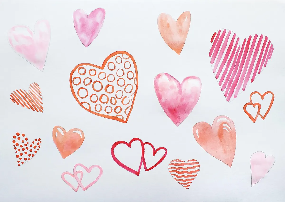
A motif is the smallest meaningful unit in a design: one shape, figure or symbol that carries the visual thought. A stylised oak leaf. A paisley teardrop. A geometric star, a running hare, a hand-drawn squiggle, a single poppy head. It can be drawn, carved, embroidered or cut from paper — the medium does not change what it is.
Motifs have their own internal logic. They have a silhouette you can trace, a weight of line, a set of colours, and edges that either hold up or go woolly when you enlarge them. They also have limits. A hare with fine whiskers still reads as a hare at 8 cm across; at 8 mm it collapses into a grey smudge. Part of designing a motif well is knowing where that limit sits.
Here is a quick test. Cover everything else on the page and look at the shape alone. If what remains still reads as a complete thing — a leaf, a bird, a star — you are looking at a motif. If it only makes sense because of what sits beside it, you are probably looking at a fragment of a larger structure.
Motifs can also be composite. A bouquet is one motif built from several smaller ones. So is a wreath, a posy, or a cluster of shells. The unit is whatever holds together as a single idea.
A pattern is a relationship, not a picture
A pattern is what happens when one or more motifs are placed according to a rule. Change the rule and you get a different pattern from the same motif. That is the quiet trick at the centre of surface design, and it is why a designer can spend a week working with a single leaf.
The rule is made of decisions: how far apart the motifs sit, whether they line up in rows or stagger, how large they are relative to each other, whether they turn or stay upright, which colours swap where. None of these are decorative afterthoughts. They are the design.
Patterns exist without motifs, too. Stripes, checks, tartans, herringbones and marled textures are built from lines, bands and tone, and nobody would argue they are not patterns. So the relationship runs one way only: a motif can become a pattern, but a pattern does not need a motif.
Four decisions that turn a motif into a pattern
- Set the repeat. Decide the tile — the area that holds one complete cycle of the design, say 20 x 20 cm. Everything else gets measured against it.
- Choose a layout. Block, brick, half-drop, mirrored or tossed. This is where a pattern picks up its rhythm: orderly, jaunty or loose.
- Work the scale. Two or three sizes of the same motif create hierarchy and give the eye somewhere to rest. A single uniform size tends to look flat.
- Rotate and recolour. Turning motifs, or swapping colours row by row, adds movement without adding new artwork.
Get these four right and a plain motif becomes a surface with pace and depth. Get them wrong and the same motif looks like wallpaper pasted by someone in a hurry.
The repeat structures worth knowing
- Block or sheet repeat — every motif sits in the same place in every tile, so the eye reads clear rows and columns. Formal, calm, straightforward to tile.
- Brick — alternate rows shift across by half, which breaks the vertical lines and softens the grid.
- Half-drop — each row drops by half the tile height, creating a gentle diagonal drift. A staple of florals and damasks.
- Mirror — the tile reflects on one or both axes. Symmetrical and often kaleidoscopic, but watch for accidental faces, arrows or letters forming where motifs meet.
- Tossed — motifs scatter at varied angles and spacings for a relaxed, hand-thrown feel. It needs disciplined spacing underneath or it reads as clutter rather than pattern.
- Stripe or engineered — motifs sit on bands, or a single motif is placed in a fixed position on the finished piece, such as a hem or a pocket.
Where the line blurs
In real work, motif and pattern overlap constantly. A placement print — one large motif centred on a shirt — is a motif doing a pattern's job of covering a surface. A ditsy print is a motif shrunk until the repeat reads as texture from across the room. A border is a pattern squeezed into a strip. And an allover design can be one enormous motif repeated four times across a two-metre panel.
The more useful question is not "which one is this?" but "what job is it doing?" If the job is to be seen as an object, treat it as a motif: clean outline, considered detail, sensible margins. If the job is to cover ground, treat it as a pattern: check the tile, the flow across the join, and how it reads from three metres away.
Why the distinction matters in practice
Briefs and clients use the words loosely, so part of the job is translating. "I want the bird bigger" could mean scale up the motif, or it could mean reduce the repeat so fewer birds appear. "The pattern looks flat" usually means the layout is too even rather than the motif being wrong. Being able to name which of the two you are changing saves a round of revisions.
The files differ as well. A motif has to survive being scaled, recoloured and placed anywhere, so keep it clean and separate from its background. A pattern lives or dies by its tile: it must join seamlessly on all four edges and be built at a size that suits the production method. A repeat that is too large for the screen, or too fine for the print resolution, causes expensive problems further down the line.
A simple way to test both
- Draw or place your motif on a square tile and save it as a single unit.
- Duplicate the tile into a 3 x 3 grid so you can see the joins repeated, not just once.
- Step back three metres, or squint until the detail dissolves. The pattern should still read as a coherent texture.
- Print it at 100% and hold it at arm's length. Check the motif's edges, then check the rhythm across the whole sheet.
- Crop a square from the middle of the print. If the crop contains a readable shape and a clear sense of pace, both parts are working.
Keep the two ideas apart in your head and the work gets easier to diagnose. The motif is the word; the pattern is the sentence. You can change one without touching the other, and knowing which you are editing is most of the skill.
Photo: Sunriseforever / Pixabay
How to Carve Rubber Stamps for Repeating Motifs on Fabric
Carve a simple rubber stamp, load it with fabric ink and print evenly spaced repeats onto cotton or linen...
Wallpaper Repeat Checklist: Measuring, Matching and Ordering with Confidence
A practical, wall-by-wall guide to measuring rooms, reading pattern repeats and match types, and ordering...
About Us